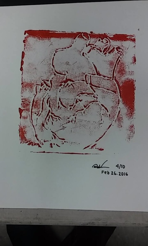
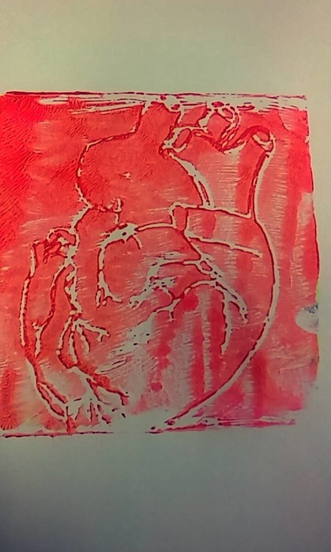
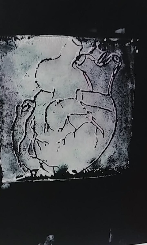
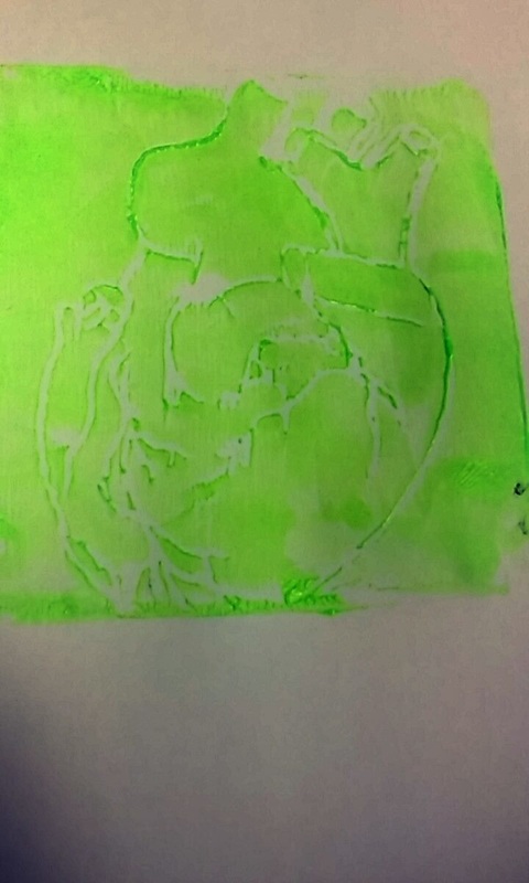
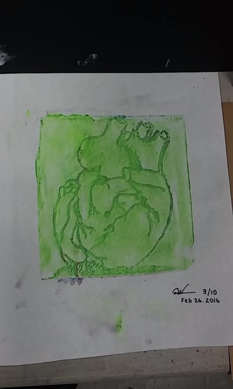
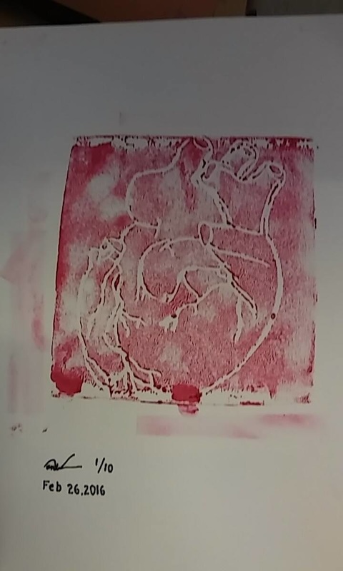
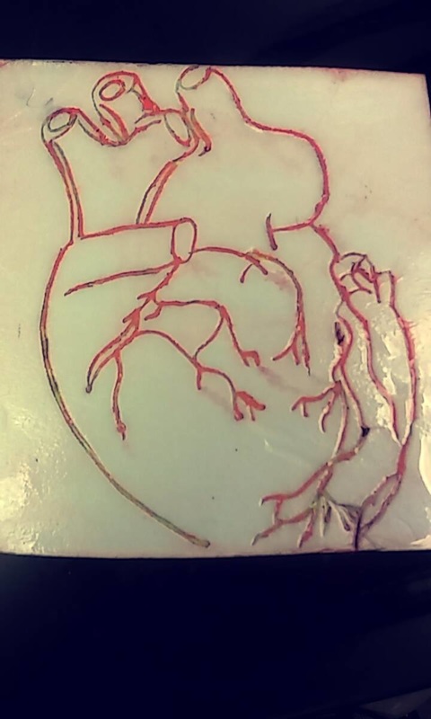
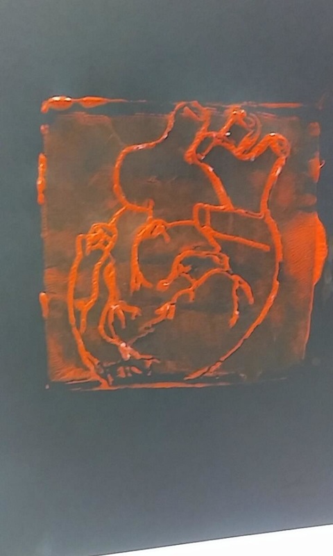
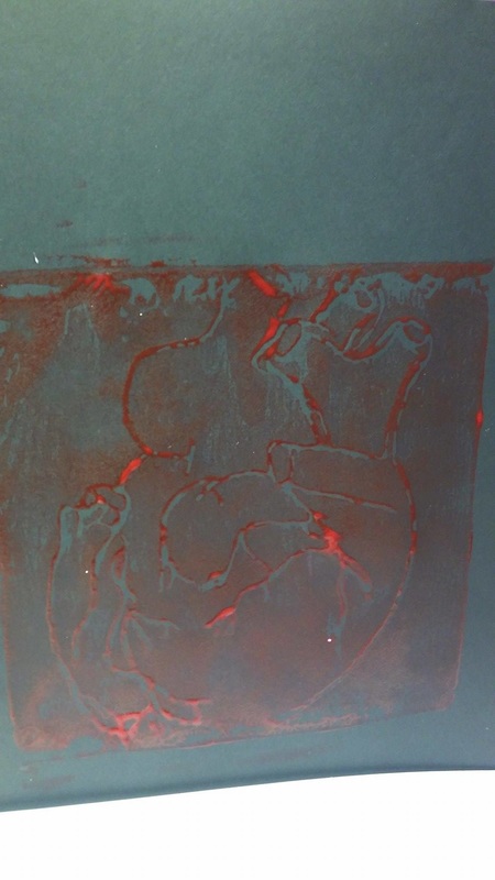
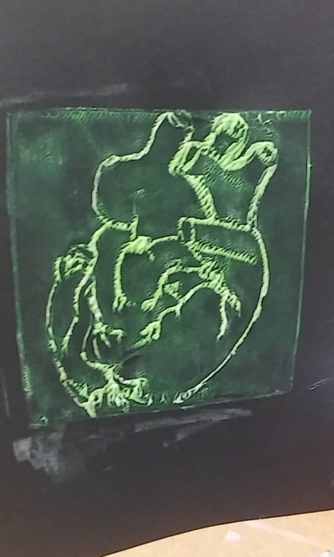
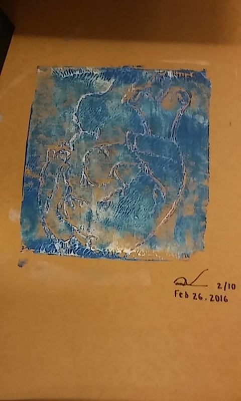
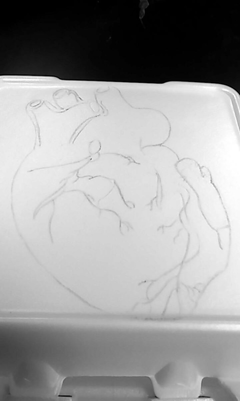
Styrofoam Print:
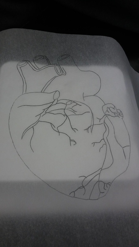
For this project I decided to work with styrofoam printing for several reasons. Styrofoam printings takes an immense amount of patience due to the amount of detail that can be created, by giving the time to this medium of art perfection can be established. When following the steps to making this print, I managed to have complete success every step of the way. Day after day I did many different sketches until I got the right one that would go on the styrofoam, to be printed in different colors. For this print my design was to do a human heart because of the powerful symbolism that it represents, being life. The process was a little frustrating when passing my sketch on the actual styrofoam, because when I carved too much or too little it made a little error that is not repairable. This got me very nervous because I like having everything perfect when it comes to my artwork. I chose to do this print with different neon colors because I thought the veins would come out very detailed on paper. Besides choosing different colors of printmaking paint, I also chose different types of colored paper. Some of those differing color papers were brown, black and white. I noticed a very big change on how the prints looked on the paper, and personally brown and white were the best shots in my opinion! The detail was noticeable which made my print absolutely perfect! My print was a success!
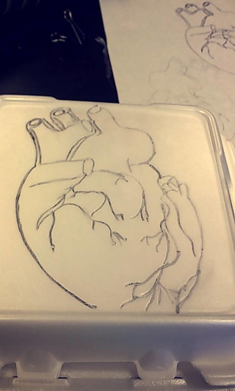
Print making:
A monoprint is a print that gets drawn directly onto a palate and then printed immediately. Contrary to the traditional form of printmaking, monoprints are only to be done once and not multiple times. A styrofoam print is when a drawing is transferred onto a styrofoam plate or tray with a pencil or ballpoint pen, creating deep grooves on the surface. Then paint is rolled onto this surface allowing the image to be repeatedly printed on difference surfaces. The former of these two types of printmaking, monoprint, did not peak my interest because of its simplicity. When creating a monoprint it was so plan and the idea of printing an image for a one time use seemed contradictory to printmaking. The process of monoprinting was also too accelerated and I feel like the opportunity for details was lost. On the other hand, styrofoam printmaking was very interesting to me. When creating the styrofoam print I initially thought the image would be very simple but the complexity and detail possible was astonishing. Monoprinting did not give me no emotion towards it but boredom, I honestly did not really like this because I have to have a quick decision on what I want to paint in order for the paint to not dry quickly and ruin my print. That’s why I chose styrofoam instead. Styrofoam on the other hand, was way more interesting than monoprints. I liked this one more because I was able to take my time in each drawing and add all the details I wanted without the fear of the paint drying.My overall opinion of printmaking at this point has been very enjoyable and positive. Creating art in this new medium was very intriguing because I liked knowing that my work could be repeated but still stay original. I could repeat an image I created uniquely several times by changing the colors in which I made the print, the textured I placed the prints on, and the background I placed behind my print. Putting this all together ended up in a very interesting new form of art that I would love to continue to explore.
Bubbly Seahorse:
I decided to go with an asymmetrical drawing of a seahorse because of the immense beauty that is to be found in sea life. A seahorse in not only beautiful visually, but symbolically as well. A seahorse to be symbolizes good times, respect, and a well grounded animal. When I look at a seahorse I see power and fulfillment; the colors of yellow and gold that can be seen on a seahorse is a beautiful display of dominance. When I decided to make my personal touch on a seahorse I decided to make the color fictitious. To bring even more life through my drawing I made my seahorse full of color to give a fantasy feel. By adding the colors I chose, I was able to make a seahorse that I had always dreamed of. I chosed colored pencil as my medium because it would be perfect for blending beautiful vibrant colors. The most difficult part of the drawing process was creating ideal proportions. Slowly, I worked harder and harder and finally got the gist of it and go tmy proportions right, which led to everything else being more simple. In order to get my colors I didn't not just want to throw any colors onto the paper form my head, so I chose to look back at the color wheel and plan accordingly. The uses of the color wheel helped me understand and use a wider variety of colors. I am very proud of my work and believe this seahorse is one in a million.
Mommy:
Beginning of the project (Process):
Starting my art project was nothing but a piece of cake! Right from the beginning I already had two ideas that were prominent in my head. Not only did I conceptually know what I wanted to achieve but I already understood what the reasoning and meaning was behind each of my ideas. My first idea was to continue with the process of giving birth and the miracle of life, my second idea was to draw a peacock for my mommy. Although illustrating my career would mean a lot to me I have been by my mother’s side since birth and I knew the importance that a peacock held to her heart. With my mother recently suffering a horrible accident I was given the opportunity to truly see how much she meant to me and how deep my love for her truly was. With the love of my mother active in my heart I drew on this will and developed the idea. My process began with a mixture of working with the neck and body. I wanted to work form the bottom up but the neck of a Peacock is such a prominent part I could stay away from it. Ratios and proportions quickly became a problem for me especially putting into account the perspective I was drawing. Mastering the head and face of the peacock was very difficult due to the extremely varied texture. The slightest change to any feature of the Peacock’s face would seem to change the look and size of another feature. This part was very frustrating but I knew that this beginning stages would be the most important.
Middle of the project (Process):
As I continued to work on the peacock I continuously kept working on the face hard and the beak until I finally got the right proportions. I then began to draw the feathers which was the easiest part to do in my opinion. Coming into this aspect of the drawing got me nervous but I wanted to show my free spirit and comfort with my mother with my strokes and colors in the feathers. After this I sat down and thought to myself which medium to use and if I wanted to improve my skills with colored pencil. Wanting to justify the beautiful colors in a Peacock I chose to go with colored pencils and sat down with my art instructor to help me develop my techniques and color choices. I quickly learned form my instructor to begin the colors in my desired area with a base color in which I would develop deeper and more beautiful colors from. This was one of my favorite parts of the drawing as I was able to learn and understand this method of coloring so quickly.
End of the project (Process):
Coming to an end to this project was a bit of a bitter sweet feeling. When it came to finishing the coloring of the drawing I continued to build upon each layer more confidently than the last bringing to life new colors with every layer. I loved the diversity of colors that was being created by this layering technique. When I saw my peacock finished I was pleased to see what I created not only because I improved my colored pencil skills but, also because this animal represents such a passion that my mother has and the love we share.
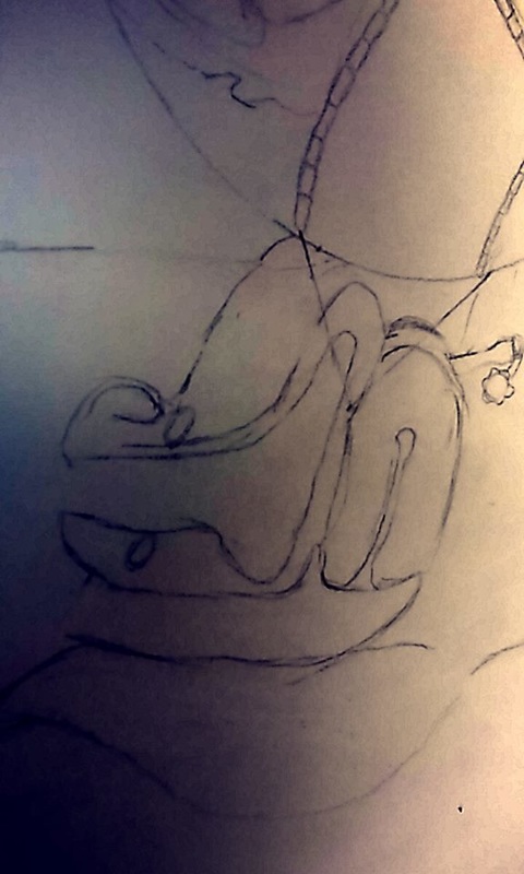
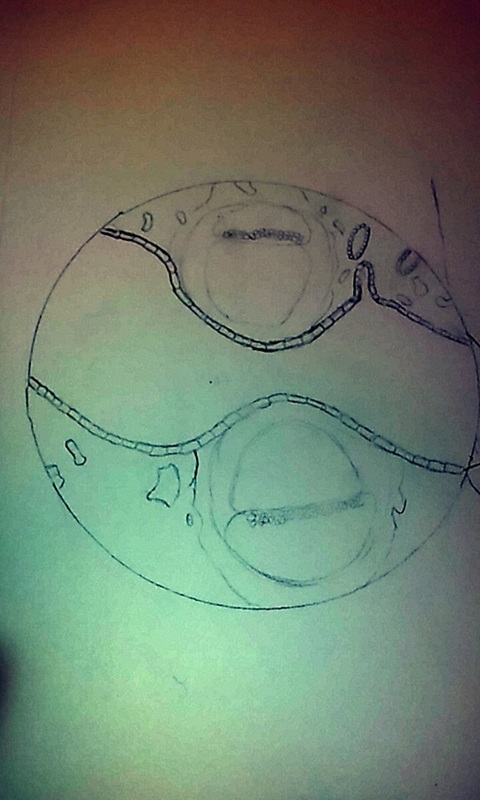
Miracle of life:
Beginning of the project (Process):
At the beginning of my art project I was undecided on what it was exactly that I wanted to start with. I wanted to narrow down my project to one central theme but be characterized in two different topics, these topics were life and growth. I had my mind set on the beauty of human life and its seemingly magical code of development. I chose this theme and sequence fully of joy but at the same time with a heavy heart. The miracle of birth and fetal development is experience by a cavalcade of women but many sadly can not. I believe human life is so mysterious and precious and terrible that it does have its limits. Planning on having a future career in Obstetrics and Gynecology was also another motivating factor. I started off by the hardest part which was the inside of the womb in detail, I began sketching a circle out and perfected it more and more every day. The hard part was when I had to begin drawing the organs around the womb which were the uterus, bladder, and all the small details it carried. I faced problems with disproportionate organs and sizes, they were way bigger than the womb which would look very unsatisfying. This beginning process was definitely starting off frustrating but exciting.
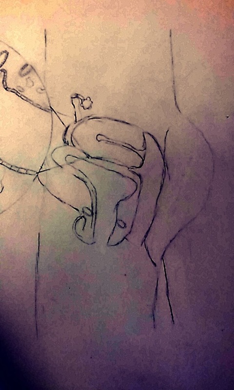
Middle of the Project (Process):
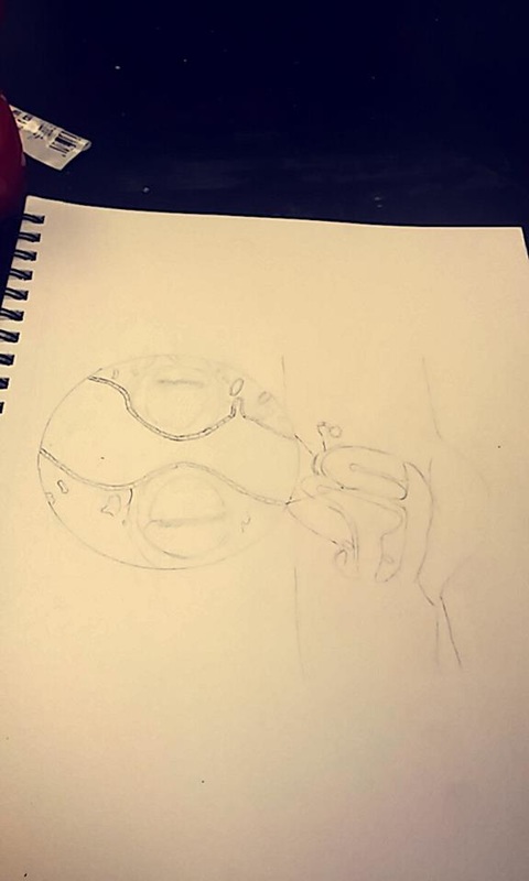
As the project continued I kept working hard on the organs until I finally got the right size and felt that everything was looking proportionate. The next question that was posed was which medium to use. I knew this was an essential part in my artwork because of the impact that possible colors and shading may hold on the final outcomes and understanding of my piece. I knew I wanted something in color but I was not sure if i wanted to paint, color pencil, markers, or crayons. I chose color pencil because it gives a softer touch to the drawing to show more delicacy and tenderness while still having the ability to create sharp separations between small details. I began to color softly and gently each piece because I am a perfectionist and I like everything to be smooth. It took me a lot of time to color because their were many different pieces I needed to do in detail in order to make the whole look complete. I was very happy with what I had and I loved what I saw on the page but it seemed to look too uniform. I wanted to add another touch to show shadow and light to make the drawing pop out more so I added light reds and pinks to show light and shadow.
End of the Project (Process):
At the end of this project I was exceptionally pleased with what I saw. I felt satisfied because the project was an ideal image of what motivates me not only educationally but as a person going through life. The miracle of birth is something I want to continue to study and hopefully one day major in and have an impact on the healthy development of babies. As a person I aspire to have a family of my own and be one of the lucky women who get to experience the miracle of birth. Although to some this may be a simple image, this image speaks to me on so many levels and connects to me on an emotional basis. The process I had to take with blogging was also quite enjoyable. I was very pleased with how I was able to proportion all of the small details in the female body. I definitely feel like a lesson to be learned was on the importance of having good proportions and spacing within a complete work of art to make the whole piece coherent. It was almost as if I was keeping a diary and a record of what I was doing as the artwork developed and progressed slowly.
At the beginning of my art project I was undecided on what it was exactly that I wanted to start with. I wanted to narrow down my project to one central theme but be characterized in two different topics, these topics were life and growth. I had my mind set on the beauty of human life and its seemingly magical code of development. I chose this theme and sequence fully of joy but at the same time with a heavy heart. The miracle of birth and fetal development is experience by a cavalcade of women but many sadly can not. I believe human life is so mysterious and precious and terrible that it does have its limits. Planning on having a future career in Obstetrics and Gynecology was also another motivating factor. I started off by the hardest part which was the inside of the womb in detail, I began sketching a circle out and perfected it more and more every day. The hard part was when I had to begin drawing the organs around the womb which were the uterus, bladder, and all the small details it carried. I faced problems with disproportionate organs and sizes, they were way bigger than the womb which would look very unsatisfying. This beginning process was definitely starting off frustrating but exciting.
Middle of the Project (Process):
As the project continued I kept working hard on the organs until I finally got the right size and felt that everything was looking proportionate. The next question that was posed was which medium to use. I knew this was an essential part in my artwork because of the impact that possible colors and shading may hold on the final outcomes and understanding of my piece. I knew I wanted something in color but I was not sure if i wanted to paint, color pencil, markers, or crayons. I chose color pencil because it gives a softer touch to the drawing to show more delicacy and tenderness while still having the ability to create sharp separations between small details. I began to color softly and gently each piece because I am a perfectionist and I like everything to be smooth. It took me a lot of time to color because their were many different pieces I needed to do in detail in order to make the whole look complete. I was very happy with what I had and I loved what I saw on the page but it seemed to look too uniform. I wanted to add another touch to show shadow and light to make the drawing pop out more so I added light reds and pinks to show light and shadow.
End of the Project (Process):
At the end of this project I was exceptionally pleased with what I saw. I felt satisfied because the project was an ideal image of what motivates me not only educationally but as a person going through life. The miracle of birth is something I want to continue to study and hopefully one day major in and have an impact on the healthy development of babies. As a person I aspire to have a family of my own and be one of the lucky women who get to experience the miracle of birth. Although to some this may be a simple image, this image speaks to me on so many levels and connects to me on an emotional basis. The process I had to take with blogging was also quite enjoyable. I was very pleased with how I was able to proportion all of the small details in the female body. I definitely feel like a lesson to be learned was on the importance of having good proportions and spacing within a complete work of art to make the whole piece coherent. It was almost as if I was keeping a diary and a record of what I was doing as the artwork developed and progressed slowly.